December 02, 2022
Even logos regenerate from time to time... but just how many Doctor Who logos have there been?
Like its lead character, Doctor Who’s logo has regenerated many times. While some logos were minor variations on what came before, others were radical departures.
From the first logo to the new(ish) logo for the 60th Anniversary, here’s a brief guide to the Doctor Who logo through the years...
Bold Text
During the eras of the First and Second Doctors, the logo was simple - you could recreate it now on any word processor with ease! The logo consisted of the show’s title written in block capitals, with the ‘Who’ literally writ large to match the width of the ‘Doctor’.
The initial iteration was written in the Grotesque One Three font and was used for the entirety of the First Doctor era. The transition to the second logo didn’t happen with the change of the Doctor. The first logo was used until The Moonbase, with the new logo debuting in The Macra Terror.
Similar in design to the first logo, this new version was written in Times New Roman. The ‘Who’ now had the same weight as the ‘Doctor’ resulting in a less bottom-heavy logo.
Reimagined in Colour
With a Third Doctor comes a third logo! Still an update on that initial design, the logo was now written in a specially commissioned font. This bold new version would be used until the beginning of Season 11, when the logo underwent the first major overhaul.
The Diamond
First appearing in The Time Warrior, this diamond-based design remained Doctor Who’s logo until the end of the 1970s.
The hallmarks of the older designs were still present, with the ‘Who’ being larger than the ‘Doctor’. In a departure from previous designs, the ‘Doctor’ had a slight curve to it and was framed. The diamond looked like it descended down the time vortex in the opening title sequence.
Neon Glow
The early to mid-1980s dropped the diamond in favour of a logo that looked like it was made completely of neon! When it first appeared the whole thing appeared to be made of light blue neon.
This lasted till the Sixth Doctor’s era when the design was refined. The colour switched to a darker, purple-ish blue, and some of the edges became more rounded.
Entering the Third Dimension
The logo for the Seventh Doctor’s era, created by graphic designer Oliver Elmes, was another big change from what had come before. Both words were rendered to appear as if the lettering was 3D. The ‘Doctor’ was positioned at an angle, and in a font that looked more handwritten.
Revisiting a Classic
When Doctor Who was reimagined for the 1996 movie starring Paul McGann as the Eighth Doctor, the logo used harkened back to the one used in the early Pertwee seasons. Although at a glance it appears to be the same, there are minor variations on the W, R, T and C.
A New Generation
The 2005 return of Doctor Who had it all. A new Doctor with the Ninth Doctor, a new companion with Rose Tyler and - you guessed it - a new logo. Gone was the layering, but instead there was the whole title being presented in a single horizontal line. The overall design was black lettering on an eye-like shield.
Hidden in Plain Sight
For Series 5 and 6, the eye-like design was retired. Its successor kept the text in a single line, but broke up the two words with the show’s initials. These initials were shaped to look like the TARDIS, with a light added on top. During the opening titles, these initials would change into the actual TARDIS and spin away down the vortex!
Switching it Up
The TARDIS-like initials were dropped from the logo for series 7. However, a fun variation was introduced for some of the episodes. For every story in the first half of the series - often referred to as Series 7 Part 1 - as well as the following Christmas Special The Snowmen, the texture of the logo changed to reflect the story. For instance, for the opening of Asylum of the Daleks, it was covered in bumps to look like a Dalek!
However, for the latter run of stories in Series 7 Part 2, the texturing on the logo remained a constant metallic grey.
Cool Blue
With what was now becoming standard practice, the Twelfth Doctor’s era introduced us to another new single-line logo. The title was written in a cool blue font, matching the new opening titles. This logo appeared at the front of 39 episodes, more than any other logo since the 2005 revival.
Blazing Back into Action
New Doctor. New Series. New Logo! The Thirteenth Doctor’s era had a clean logo, continuing the text as a single horizontal line. The middle line of the H smudges through the O and a line cuts in the D as well, as if the TARDIS has travelled straight through the middle of it! The fiery hues call back to the eye-shields used in the Ninth and Tenth Doctors' eras, and the colours of the Doctors’ infamous regeneration.
The Diamond Shines Again
What’s old is new again!
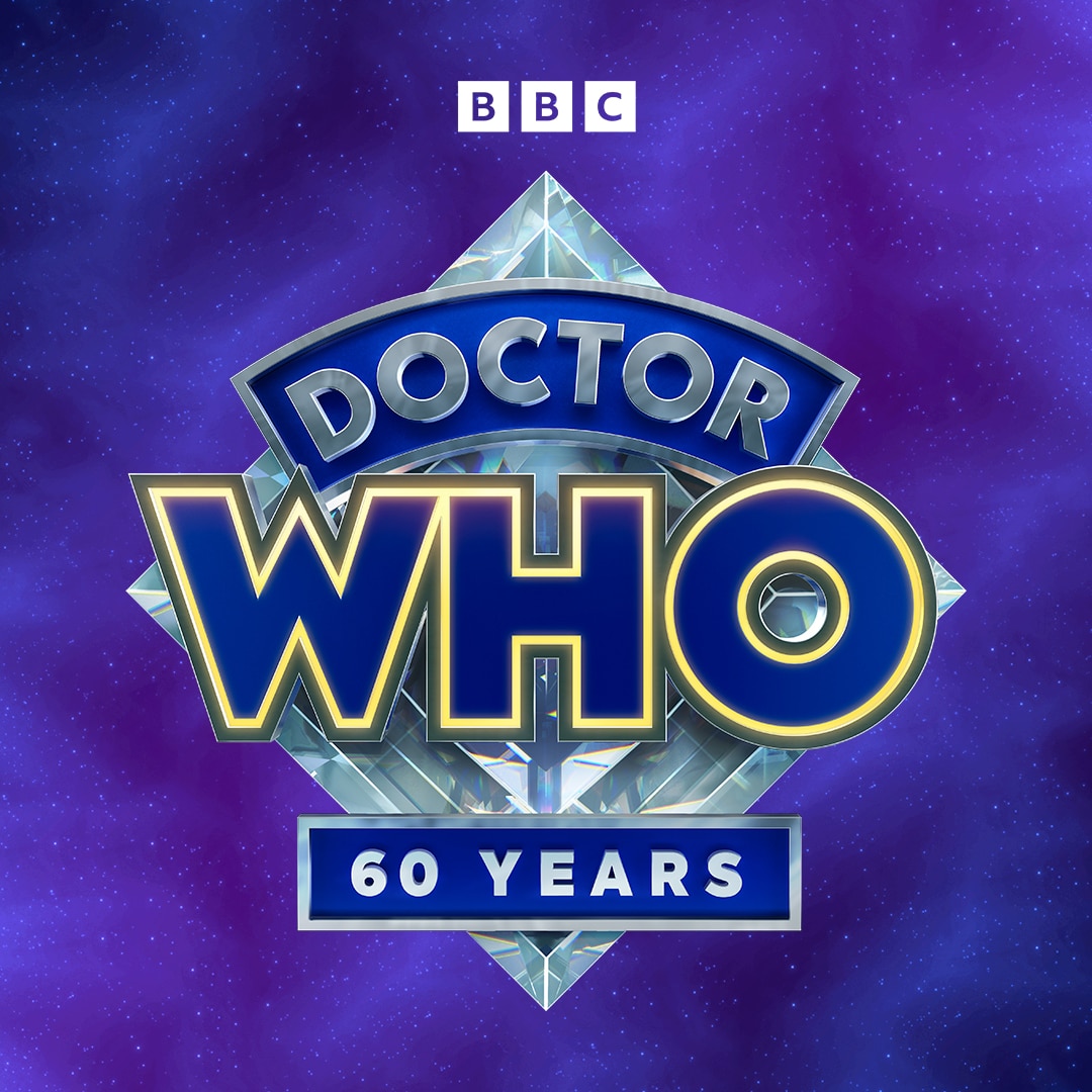
Appropriately enough, the diamond-style logo returns for the show’s diamond anniversary. The edges of the ‘Who’ are now highlighted in yellow, and the blues have never been deeper, but it’s a fitting logo for an exciting new period of the show’s long history.

And specially for the 60th anniversary, you should be able to see a diamond variant around to celebrate 60 years of Doctor Who!


